HW-Digital_IDs
HIDDEN WONDERS:
Digital IDs
A responsive web app built to explore all the specimens and artifacts in the Hidden Wonder’s exhibit. Explored both on personal mobile devices and 15 installed touchscreens. Content in four languages which was a first for the museum.
Team:
Andrew Sawyer – Visual Design & UX
Tina Besa – Animation
Anna Simmons & Adrienne Van Allen – Content
Gayle Laird – Photography
Josh Ause – Development
Location:
California Academy of Sciences museum
Year:
2022
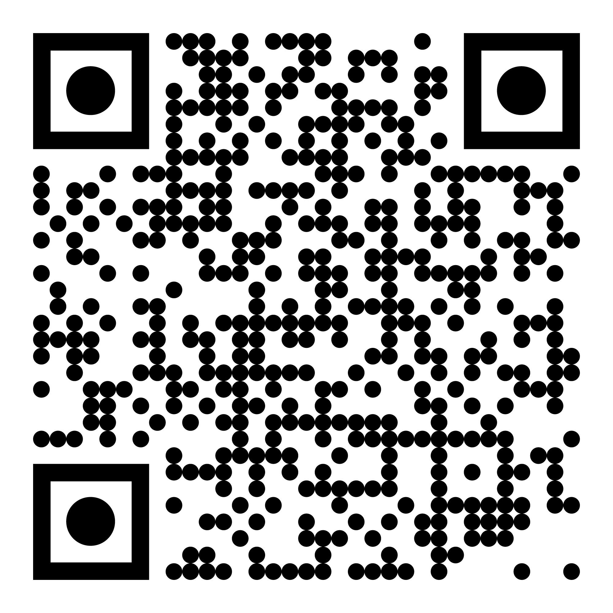
In the gallery, there are 15” monitors installed as kiosks. If visitors choose to use their mobile device they can scan the QR code on the content rail at the bottom of the case. The responsive layout for this web app creates a unified experience across touchpoints.
The design: step by step
Scan this QR to experience the web app for yourself!
Case Selection Menu:
This menu is only needed on mobile, allows visitors to switch between the 14 cases worth of stories and specimens.
Home Screen - Example A:
This case is all about birds. The layout emphasizes stories about groups of objects.
Home Screen - Example B:
A different case. This one is about specimens collected along the California shoreline. The modular design allows for a range of layouts to reflect the design of the case
See All Menu:
By clicking the button at the bottom of the home screen a menu is opened that shows every object in the case. This view emphasizes the objects rather than group stories. Through visitor research we learned this is the content visitors expected to see when interacting with an ID screen.
Main Content - Specimen Group Page:
By clicking the blue circle (either the menu page or the home screen) a visitor sees the expanded content about the history and importance of the objects. The thumbnails click through to larger image detail pages.
Main Content - Specimen Group Page:
Below the story about the group of objects is a list of the specimens in the group. The layout mimics the “See All” menu intentionally to reinforce the UX pattern.
Specimen Detail Page:
This view is for visitors to zoom in and inspect specimens close up in ways that are only possible with a digital experience. Left/Right arrows show secondary media. Buttons at the bottom of the page navigate back to the home page (left) and to the group page (right).


